Design Challenge: Mobile App Signup
This prompt seemed like a good opportunity to do two things:
Prototype a native mobile experience, with focus on transitions and animations
Design an onboarding flow that wasn’t just a simple form
Execution Plan
Research/Market Analysis/Context Gathering
FigJam: Scope Definition, Flow
Wireframes + UI Pattern Research
Brand + Prototyping // Test
Note: I was able to pull a high-fidelity prototype together quickly by changing a few styles on the Dynamic Layer UI Kit from the Figma Community. It’s an incredible starter pack with great use of variables and tokens.
Words matter.
So is it sign up, signup, or sign-up?
“Sign up” is a verb. And less formal.
“Signup” is a noun. And more formal.
“Sign-up”…is technically an adjective. But apparently “outdated” and “unnatural”. Glad to know that I’ve been aging myself.
What does “a signup flow” entail?
The scope can also vary drastically based on the goals of the platform or service and how metrics are defined.
Does sign up just mean create an account?
Or does it continue until the user registers for a membership or class? (including payment & waivers)
Should it include any educational content or introductory guidance?
50 Shades of Signup
Weight Watchers: Transaction Focused
Key Takeaways
Engaging landing screen due to video background, lots of movement
Order of buttons assumes user is new since they’re not already logged in
Emphasis on “try free” is a good way to encourage initial engagement of a paid service
Flow: Try Free CTA > Pick a plan > Create an account > Pay
Not much time investment needed to get set up
Khan Academy: Ease of Use
Key Takeaways
Ability to create an account using Google, Facebook, Apple, or Email is highly convenient
Flow: Sign in CTA > Create Account > Choose topic area of interest
Very quick, very little investment of time or energy
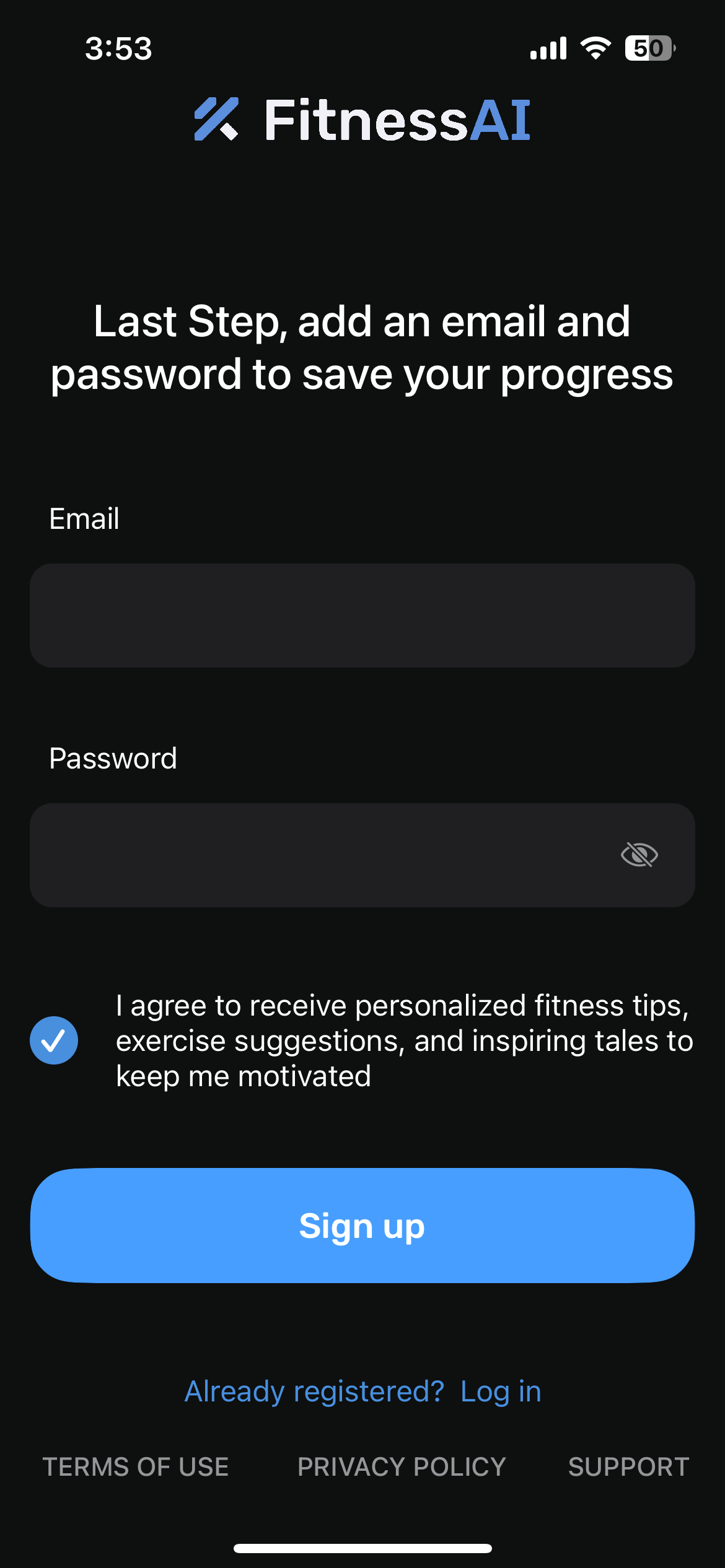
Fitness AI: Customized Plans
Key Takeaways
Large primary button emphasizes “Get Started” with much smaller Login option
User invests time in workflow up front leading them to want to buy the software
Flow: Get Started CTA > Choose gender > Choose goals > Choose motivators > Choose focus area > Choose activity level > Name > Get My Plan CTA > Select plan > Pay > Create account
Tweaking out: App Launch
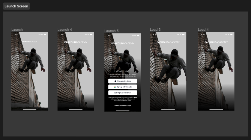
I spent a majority of the time making tweaks to what is a very “simple” screen, the launch of the app and transition into login or account creation. My personal goal for this challenge was to work on my visual UI skills, so that’s where I spent my time!
Original mock had a single button for account creation and a ghost button for login
Revision allowed user to create an account directly from the launch screen, reducing clicks required for account creation. I darkened the background gradient for readability, added some copy, introduced the terms, and played with the animation to make the transition smoother.
A few things I learned
Big and small, you never know what you’re going to realize by completing even the most straightforward of design challenges. Here are a few tidbits I picked up, concepts taken further than I’ve seen before, or things I thought were generally cool!
Usage of Primitives & Tokens
The Dynamic Layer UI Kit was set up really nicely. It had the foundational elements I needed and had really well organized color variables, making it easy to switch between light and dark mode. Updating the UI kit for branding was a breeze because the variables and typography styles were applied properly to reusable components in the system.
Artificial Intelligence isn’t too intelligent, yet.
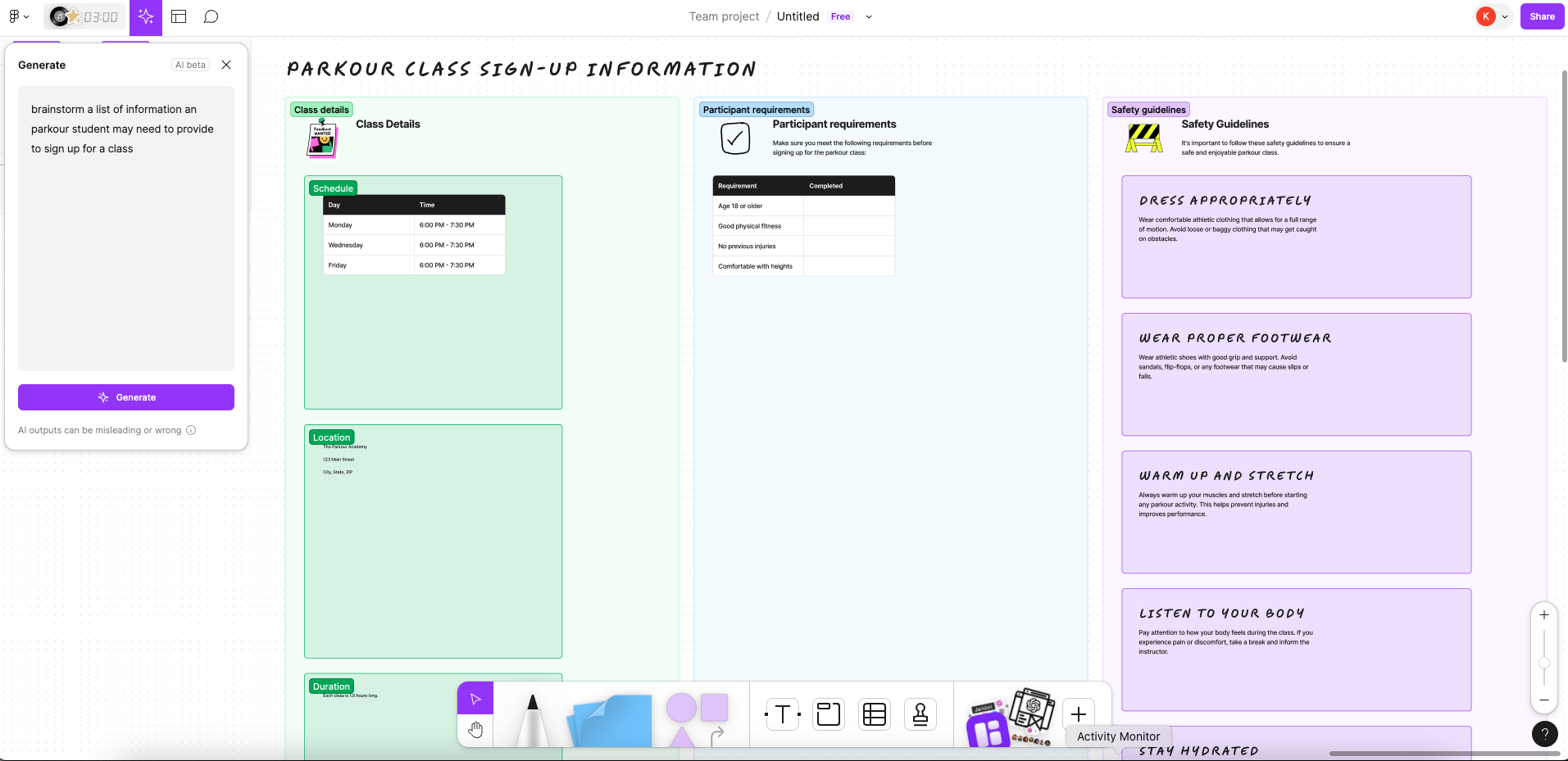
I played with some of the new features Figma released to see which part of my design workflow I could automate or supplement with AI. While it was helpful for basic things like mind maps of general concepts, the FigJam AI struggled with more complex tasks like creating user flows, until I was able to be extremely specific, at which point the flow wasn’t as necessary. Even then, it needed human intervention to add limitations and corrections. The AI created a flow that likely met minimum requirements and was just fine, but it didn’t offer anything based on reason, context, or details.
Onboarding Flow: Work in Progress
Prototype coming soon!


