Prompt
Design a mixed-reality button for the nearest airport and make 3 variations.
Unlike many prompts, today’s challenge didn’t immediately make sense to me, but because it was intriguing enough to be fun, I went with it! I don’t have experience designing for AR/VR or mixed-reality and it seemed like a perfect opportunity to learn while designing a “simple” component.
Where to start?
I started by making sure my understanding of mixed-reality was correct (thanks Google) and took it a step further to see if there were design guidelines for mixed reality buttons (thanks Microsoft!). That was just the start.
Establishing understanding to define scope
My understanding was that mixed reality was just that, a mix of real-world and computer-generated content. The first thing that came to mind was the AR filters on Snapchat, but what makes those experiences possible is the mobile device itself which has a physical screen and a traditional UI including buttons (read: boring). I wanted this to be a bit more challenging, so I decided I would be designing for a headset.
After some additional research, I learned that what I was imagining was a version of AR/VR that requires holograms, which have their own specific design guidelines. Holograms are most widely used in VR, but the original Google Glass and the Microsoft HoloLens 2 are trying to accomplish true mixed-reality by overlaying holograms on the real world.
SECONDARY RESEARCH
What’s in a button
Visual Affordances
The first challenge on a hologram is communicating to a a user that a button can be interacted with. Affordance help a user recognize that the pixels floating in front of them can be pushed, clicked, dragged, etc. Microsoft recommends using light, depth (or “compression”), and a pulsing animation to suggest interactivity.
Audio Feedback
Microsoft also recommends using audio cues when actions begin and end, including direct contact (tapping with a finger) and pinching (part of their “hand ray” interaction for selecting objects further away) to ensure the user has has an additional way to identify a clickable object while creating a sense of depth in the VR space. This presumably also applies to AR.
Visual Design
Guidance from various resources included:
Center actions and content on wide frames
Clearly communicating the state of a component/element (unlike desktop or mobile, buttons stay “pressed”)
Avoid white backgrounds, as large bright areas can cause user discomfort
Understand that black will appear transparent in holograms
The user’s viewing angle dictates the size of the button, which should be no smaller than 3.2 x 3.2 cm for a direct interaction.
EXAMPLE UIs
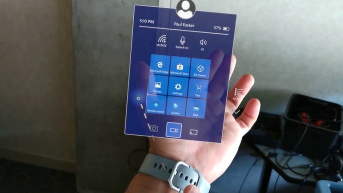
HoloLens 2 Standard Operating System UI (Mixed Reality / AR)
Vision Pro UI (Virtual Reality)

Did you know? It’s easier for people to turn their heads left and right and up and down.
PROBLEM FRAMING
Mixed Reality at the Airport
The next challenge was identifying a use case for this button. Why would someone be in a mixed-reality environment in an airport? Are they at an actual airport using a headset that’s reminiscent of Google Glass? Or are they at a virtual airport with friends?
If people want to hangout at a virtual airport, that’s cool I guess, but not something I was particularly interested in designing for. Also, if we are able to get to a point of technological advancement where mixed-reality means wearing headsets in the wild, there could be a real business case for developing this button. So I went with that!
Next, I needed a user. I had already spent a lot of time on research and didn’t want to spin my wheels on personas and task flows, so as a frequent traveler, I decided I was a good target user. I know, I know, I am NOT (usually) the user, but given the short timeline, this was an exception. Considering my tasks at an airport, I identified that I rarely check-in to my flight before arriving for my flight. With that, I decided to design a mixed-reality check-in experience at Chicago’s O’Hare airport for United. (Disclaimer: They did not sponsor, endorse, or approve of this work.)
Designs
V1 - Check-in
Using the Microsoft MRTK3 UI Kit, it was pretty easy to build a simplified menu bar based on the United mobile app. For this version I:
Used the HoloLens viewport size of 1440x936px to set the “scene” and ensure the button sizes were appropriate.
Tweaked the colors to match United’s branding (this wound up being a mistake).
Removed two of the mobile app’s nav items (Home and Book Flight) as they didn’t seem relevant to this particular experience.
Added a red bubble to indicate an active app
Just looking at the scene I realized it would be odd to have this app hanging out in the periphery. How did the app open? Why? The next iteration need to explain how the hologram gets into the user’s frame of view. Also, if this person is right handed, it seems awkward to have this on the left side of view.
Another concern is that the menu would block real life objects, even if the graphic renders as more transparent in the headset. This is when I started to question the use case, particularly the assumption that the user could interact with this while walking to security.
Why is the menu blue? I was using the HoloLens Design Kit which is based on that particular operating system. Every device will have their own.
V2 - Adding a dialogue
The HoloLens UI kit also included a dialogue which came in handy. Theoretically using location services and some logic, the app would prompt the user to check-in, with “Yes” being the preferred option.
However, this dialogue left a little to be desired. How did the user know it was specifically for United? Could they come back to it later?
When I walk to security, I’m listening to Spotify, tipping my Uber driver, and sending texts all at the same time; what does this look like if the user has other apps open and running?
V3 - Building a flow
In a new iteration, I removed the United branding (colors and typography) from the base dialogue component to return it to the HoloLens operating standard.
I also added a simple app icon to the left corner of the dialogue to indicate where the notification was from. The icon also gives the user a target to interact with for actions like dragging the dialogue to a new location or double-tap to minimize.
Thinking about the holograms being a layover the real world, I realized the user’s field of vision is very similar to looking at a desktop screen, so I:
Added a way for the user to see which apps are running.
Moved the menu bar up into the line of sight after learning that the hologram itself is only visible in a very small portion of the screen. This also makes it usable by left and right-handed users.
Prototyped an onHover interaction using an overlay swap for a larger icon size, which worked, but was a bit clunky.
Generally, opening an app using voice is probably a better option here (assuming the airport isn’t too loud), but I kept the scope of this challenge focused on visual design.
United App Home Page
Last, I spent 10 minutes creating a landing screen for the app upon launch based on the United Mobile app.
Limited actions to immediate action (Check-In) and viewing additional trip details with the assumption the Boarding Pass wouldn’t have a functional use. You can’t exactly scan a hologram, yet.
Retained basic flight info for quick informative scanning
A loading animation or state is likely required between launch and the landing screen appearing. The risk with a visual loading indicator is distracting the user from the real-world surroundings. The the trade-off I’d recommend is a minimal visual cue, relying on audio to communicate the change of state.
Hindsight: Things I would do differently next time
Prototyped an experience that doesn’t involved moving/walking
Used a photo that was straight-on, not at an angle to make it seem more realistic
Not picked a prompt that required me to have hardware to truly understand and test the mechanics of the design
Picked a specific operating system sooner rather than waffling between multiple and trying to customize
I would have…
Takeaways
“It’s just a button”
While the scope of this challenge was to just design 3 variations of a button, I found that hard to do with having little background in the space. A majority of the time was spent on research and understanding how designing for mixed-reality works, not on designing a button. I think that says a lot about who I am and how I work; I like to understand the technology, find established design principles, explore open source resources, etc. before diving into design because more often than not, you can save time but not having to re-invent the wheel.
That said, I could have just focused on the button. I could have spent my time learning Aero or Bezi to animate and add sounds, but instead I found myself gravitating to the “bigger picture”. I like to think through a holistic experience first, taking a systems-level approach to design versus focusing on specific interactions. There is immense value to both skill sets, I just happen to gravitate to the UX because in this instance, I didn’t have the context of how/when/where/why the button would be used to be able to design one well. Once I have an idea of that, I can focus on the details.
The obvious limitations of this prototype are my skills and the time I allotted myself. The next steps would be to make this 2D experience feel more real by learning an animation tools such as Aero or Bezi, adding in some sounds, and buying a headset to test it out!
Other things I explored
Immersive vs. holographic devices including HoloLens, Magic Leap 2, and Vision Pro
Prototyping in Adobe Aero
Various Figma Community Assets
Designing an experience for security to inspect baggage and an interactive airport map (If I read the prompt literally, the map would have made the most sense. It turns out someone else also had this idea!)
Operating system design vs. app design for mixed-reality
Is designing for VR that different?
Microsoft has a set of “flat” buttons in their Figma UI kit; the base component and variants aren’t that different for MR and 2D. The primary differences are:
Containers for checkboxes and radios
The size of the buttons is much larger in MR relative to the size of the viewport
It’s not as comprehensive of a UI kit as I’ve seen including variable for states, particularly for prototyping (Ex. the Deselected Hover state isn’t linked to the Selected state with an onClick action). I’m curious if that’s because the team prototypes in other tools or if they just haven’t gotten to it.
TL;DR: Designing for holographic headset experiences may not be all that different than designing for 2D
Resources
Note: I do not own many of the images in this post and do not claim to. If you are the rightful owner of these images and would like them removed, please contact me and I’d be happy to do so.
Apple Vision Pro Unofficial UI Kit for Figma by Jishnu
Designing Mixed Reality Experiences: 6 Lessons Learned by Matteo Setti
Designing the Future: How we prototype in AR & VR by Rebecca C., Barrett F., Sagar R. from Meta
Designing AR Hand UI by Daniel Marquesee
How to Easily Distinguish Augmented Reality and Holograms by Dmitry Shatkov


